Typography
Typography is the structure of every well-designed interface. It is used to guide users through the interface and help them understand the logic behind the interface intuitively.
Fluid Typography
Fluid Typography is composed of tokens that include specific font values such as font family, size, and line height. These typography tokens can be implemented in code wherever text styles are used in design and Figma.
Apply heading, body, and code text styles in your designs. Each style features optimized spacing values based on font size and is designed to integrate seamlessly with our other foundations like Fluid Colors and Fluid Sizes.

Typography Principles

Accessibility
Fluid Typography, Tokens and Components are designed with accessibility in mind. Coding your typographic experiences correctly ensures that assistive technologies can accurately interpret and present your content.

Readability
Readability is essential for effective communication. Proper line length, font size, and spacing make text easy to read and understand. By optimizing these elements, we ensure that users can comfortably read content without strain, enhancing their overall experience.

Harmony
Harmony in typography creates a balanced and cohesive visual experience. By using a consistent typescale and maintaining uniform spacing and alignment, we achieve a harmonious design. This balance enhances readability accross ENGIE’s products.
Fonts
Product fonts
Product fonts are specifically chosen for digital interfaces, ensuring legibility and readability across various screen sizes and resolutions.


Brand fonts
Brand fonts are designed to reflect the brand's identity and are typically used in print materials, logos, and other offline applications.

Clan Pro
Do not use for digital applications.
To download, please contact the brand direction of ENGIE.

Right Grotesk
Do not use for digital applications.
To download, please contact the brand direction of ENGIE.
Typescale
|
Figma style
|
Font size
|
Line height
|
Font family
|
Font weight
|
Semantic
|
|
|---|---|---|---|---|---|---|
| Aa | Heading 2XL | 4.75 rem / 76 px | 5.5 rem / 88 px | default | bold | h1 |
| Aa | Heading XL | 3.375 rem / 54 px | 4 rem / 64 px | default | bold | h2 |
| Aa | Heading L (default) | 2.25 rem / 36 px | 3 rem / 48 px | default | bold | h3 |
| Aa | Heading M | 1.75 rem / 28 px | 2.25 rem / 36 px | default | bold | h4 |
| Aa | Heading S | 1.5 rem / 24 px | 2 rem / 32 px | default | regular, bold | h5 |
| Aa | Heading XS | 1.25 rem / 20 px | 1.75 rem / 28 px | default | regular, bold | h6 |
|
Figma style
|
Font size
|
Line height
|
Font family
|
Font weight
|
Semantic
|
|
|---|---|---|---|---|---|---|
| Aa | Text L | 1.125 rem / 18 px | 1.5 rem / 24 px | default, monospace | regular, bold, italic | p |
| Aa | Text M (default) | 1 rem / 16 px | 1.5 rem / 24 px | default, monospace | regular, bold, italic | p |
| Aa | Text S | 0.875 rem / 14 px | 1.25 rem / 20 px | default, monospace | regular, bold, italic | small |
| Aa | Text XS | 0.75 rem / 12 px | 1 rem / 16 px | default, monospace | regular, bold, italic | small |
Heading
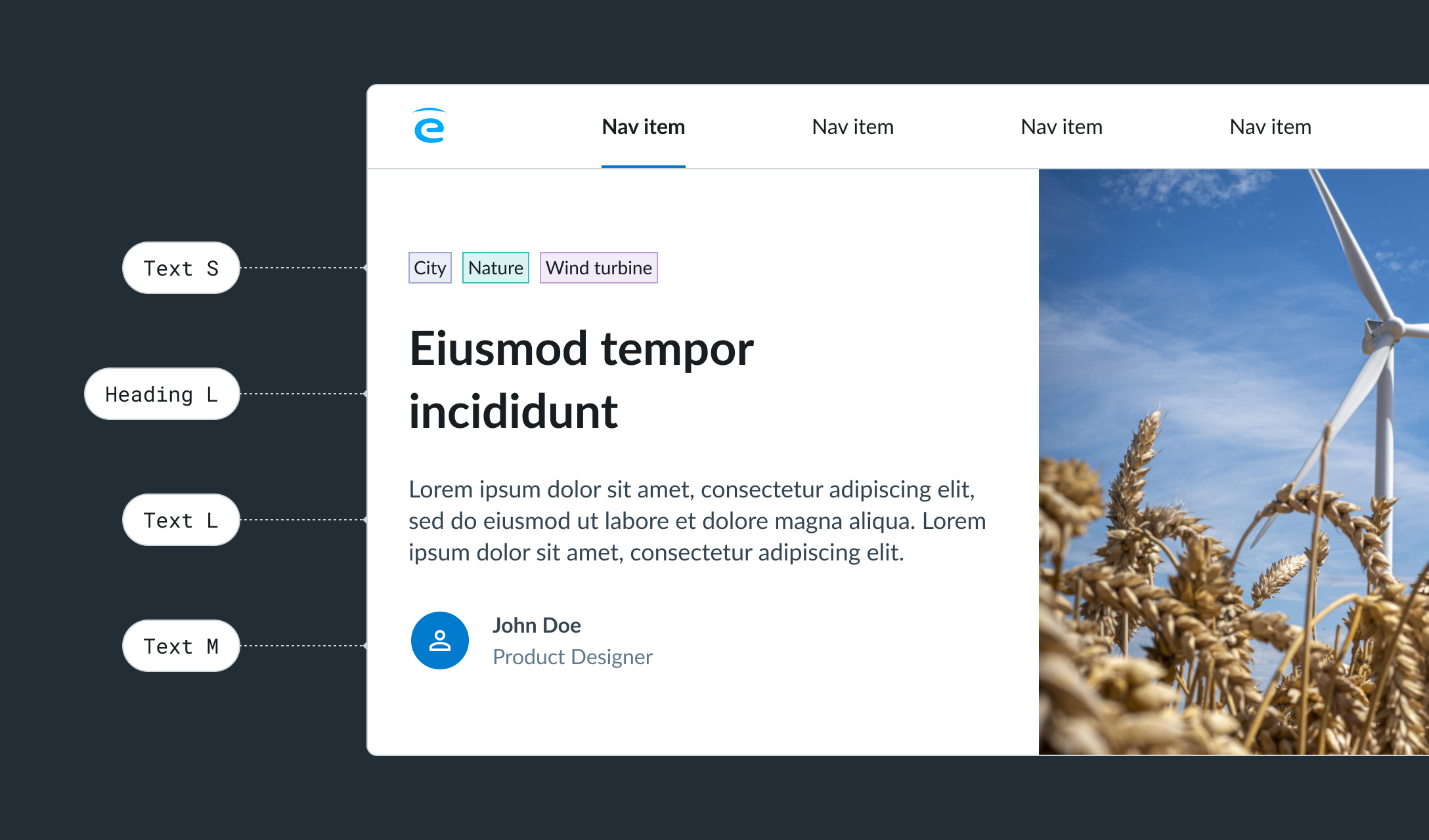
Headings are used for page titles or subheadings to introduce content. They are designed to contrast with body content, enhancing visual hierarchy and helping readers easily understand the content structure.
- Heading XL and 2XL are ideal for brand and marketing content.
- Heading M and L are suitable for page titles.
- Heading S is used for large components where space is not limited.
- Heading XS is perfect for titles in small components where space is limited.
Text
Text is used for the main content, typically following headings. It serves as detailed descriptions and messages but can also stand alone in components.
- Text L is the size for long-form content, such as blogs.
- Text M is the default size for all common text content.
- Text XS and S should be used sparingly for secondary level content.
Do / Dont's
Line length


Visual hierarchy

